Thiebaud: A Celebration
Five months after Wayne Thiebaud passed away on Christmas Day at the age of 101, the Crocker Art Museum is remounting its Covid-curtailed 2020 retrospective of the artist’s career—this time with more than a dozen additional works. The museum’s chief curator Scott A. Shields gives us a tour of 10 of the 117 pieces in the exhibition, which opens May 29, and lends his perspective on Sacramento’s “patron saint of painters.”
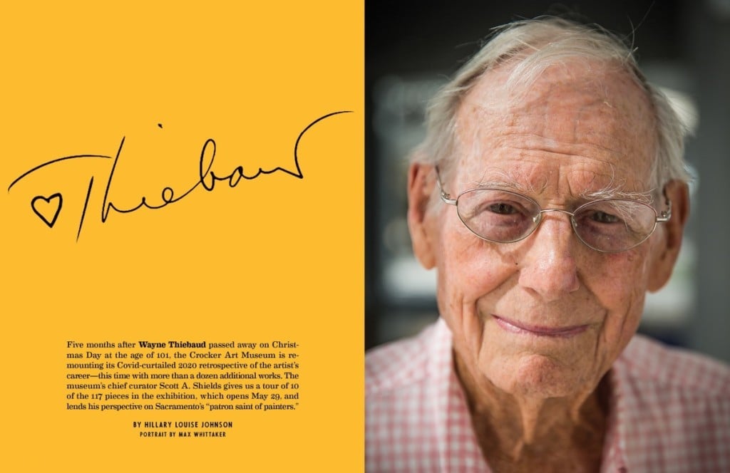
The last time Crocker Art Museum chief curator Scott A. Shields took Wayne Thiebaud out for lunch, the artist ordered a plate of deviled eggs—a subject he had often painted. When the dish arrived dotted with capers, Thiebaud mimed being scandalized, and declared them “un-American!” As Shields explains, that moment perfectly captured the late, legendary painter’s gentle sense of humor and his nostalgia for the idyllic, numinous images of Americana—deviled eggs, cherry pies, bow ties, circus clowns—that he captured in his signature style.
Thiebaud, who died on Christmas Day last year at the age of 101, spent about 70 years displaying his pieces at the Crocker. Indeed, the museum has mounted solo exhibits of his work every decade since his first one-man show there in 1951, up to and including 2020’s Wayne Thiebaud 100.
Along the way, he quietly became one of the highest-grossing living artists in the world. In 2020, his 1962 painting of pinball machines sold at Christie’s for $19.1 million—a new auction record for the artist. But he got his start here, serving as a cartoonist and graphic artist while stationed at Mather Air Force Base in the 1940s. He began teaching at Sacramento State in 1950, then at Sacramento City College, and eventually landed at UC Davis, where he taught from 1960 to 2002. He lived in the same modest Land Park house that he and his wife Betty Jean purchased in 1971 until his death.
“People come up and tell me they remember him sitting out in a Safeway parking lot or the Starlite Drive-In, selling [artwork] out of the back of his car,” Shields says, noting that these same people also wince at not having bought anything. “He managed to stay grounded, managed to stay humble. He could work with any museum in the world. It tells you a lot that he wanted to do his 100th birthday show in Sacramento.”
Whether you caught the 2020 show before its run was cut short by Covid or not, this reboot, Thiebaud: A Celebration, 1920-2021, is a must-see, as it includes a trove of new works. Just months before his death, the museum received a donation of another 17 pieces from Thiebaud, as well as an additional pastel from a private collector, all of which are included in the new exhibit, which opens May 29 and continues through Aug. 7. Here is a preview of 10 of the works that will be on view during the encore presentation—from a 1950s rendering of Thiebaud’s SMUD mural to 2019’s Sunset Streets Study, the most recent piece in the collection—accompanied by commentary from Shields that places each in context of Thiebaud’s oeuvre.
“We all feel like we know him, and we all feel like he’s part of us,” says the curator. “But he became bigger than us, and he really belongs to the nation and the world. When I went to Italy, I was struck by how even just small Italian towns have an artist that is identified with that city for the past 500 years. And they’re kind of like a patron artist saint of their town. And I think that two or three hundred years from now, people are going to come to Sacramento, and he’s going to be the patron saint of painters for us.”
Pies, Pies, Pies
oil on canvas, 1961

© Wayne Thiebaud / Licensed by VAGA at Artists Rights Society (ARS), NY
“1960-61 is really when he finds his voice and becomes the artist that we know. He was using a lot more brushwork at the time. And then he landed on the idea that paint could mimic what he was making—he called it ‘object transference.’ He could make paint look like meringue or frosting or ice cream; it could be a squiggle of ketchup and mustard. And even late in his career, when he was doing clowns, clown makeup looked like paint and the paint looked like clown makeup. So he never really relinquished that.
Everything that he’d done in his life practically led up to painting food and desserts. He had worked at an ice cream and hot dog shop called Mile High and Red Hot, and he’d worked at the California State Fair [brimming with food like candy apples and cotton candy], hanging the art shows. He’d had a show at the Nut Tree in Vacaville, where they had a big sweets counter and lots of desserts. If you look at the old photos of the confections the Nut Tree was selling [like pinwheel lollipops and hand-rolled candy sticks], it looks a lot like Thiebaud’s work—all this homespun Americana. He did not paint French desserts, which are maybe prettier than American pies and cakes. When he would paint bread, it was usually American white sandwich bread—not a baguette. I don’t think I’ve ever seen Thiebaud spaghetti.
He was offered a position at UC Davis and took it, and then, he eventually made enough paintings of common objects and took them to New York, and was pretty much universally turned down, except for his last stop—the Allan Stone gallery. In 1962, Allan Stone [mounted] a show. Every single piece sold, and every major newspaper and magazine wrote about him. It was a huge moment for him.”
Water City
watercolor, pencil and gouache rendering, 1959

© 2022 Wayne Thiebaud Foundation / Licensed by VAGA at Artists Rights Society (ARS), NY
“How lucky are we to have a mural by Wayne Thiebaud in our town?
I would call this a preliminary sketch. There are multiple [versions]. The one we have is 6 and three-quarter inches by 17 and an eighth inches. The finished mural [a mosaic that graces the south side of the SMUD headquarters near East Sacramento] is 15 feet high and 250 feet long. He used this rendering as something to give to the mosaic fabricators because he wouldn’t have done the mosaic work himself. We’re talking thousands of little tiles.
At that time, he was teaching at Sacramento City College and was the head of the art department, but was still an emerging artist. Later, he did a lot of agricultural scenes of our region, and urban scenes of San Francisco streets. But I think he represented Sacramento in different ways. A lot of his subject matter really was coming out of our region. Just, by that time, he wasn’t really focusing on its architecture.
Early on, he did more scenes of Sacramento shop windows, and sometimes buildings and landscapes. Water City comes at a pivotal period, [right before] he found his signature style. But you start to see it in the mural—the white background with color in the middle. And doing it as a mosaic makes it a little like pointillism. He was looking at things like Byzantine mosaics. And there’s a little Pop [Art] quality that’s kind of starting to show through, but the execution of it is still more based in different things like pointillism and abstract expressionism. I think he probably spent a better part of a year conceptualizing and working on it.”
Cake Window
etching, 1964

© Wayne Thiebaud / Licensed by VAGA at Artists Rights Society (ARS), NY
“Here he takes the cross-hatched background, which reads as a reflective window that you’re looking through. With abstract expressionism, the painting itself was more important than what it depicted. And so, it was just totally flat. Thiebaud and his generation really punctured the picture plane, and introduced—reintroduced— depth and recession and volume and weight and shadow and all those things that make things look like what they look like.
Thiebaud was looking at artists like Paul Cezanne, who essentially said that if you can learn to paint a cylinder, a sphere, a cube, you ought to know how to paint. So Thiebaud was looking at basic shapes. He would do a wheel of cheese and instead of calling it Cheese Wedges, he would call it Sliced Circle.
He was in a lot of different group shows at this time, being paired with all the major artists who we now think of as Pop, like Warhol and Roy Lichtenstein, who were trying to emulate machines in the way they screen-printed things—it was all very flat. But the handcrafted object was always important to Thiebaud, and it was always about the paint quality and painterliness. It was really interesting to me to read early reviews of Thiebaud. A lot of people thought he was critiquing contemporary culture and consumerism, but now we read reviews of the exact same paintings, and people think of them as celebratory and nostalgic and optimistic. I feel like Andy Warhol really didn’t like soup, but Wayne Thiebaud really liked pie.”
Betty Jean Thiebaud and Book
oil on canvas, 1965-1969

© Wayne Thiebaud / Licensed by VAGA at Artists Rights Society (ARS), NY
“The very first time I ever talked to him, I was looking at a painting of his that had a big date span—like 10 years or something. So I asked him about it. ‘I’m still learning,’ he said. As long as he had a painting in his possession, if he wanted to go back and work on that, he’d do so.
[Thiebaud’s wife and frequent muse] Betty Jean was often his best critic, I think. I only know this because he would sometimes say at receptions that Betty Jean would tell him that he needed to do a little more work on a painting because it wasn’t quite up to his standards.
He relied on her eyes a lot, and also relied on her as a model. When he started to do figures, he initially did them from memory. A lot of his desserts and food were from memory because he thought it gave him a distance from reality. But he learned he couldn’t do that with figures because people know the human face so well that they’d know if it’s wrong. So he started to work from models, and because he didn’t have a lot of money at the time, he’d often use family and friends.
He also said, ‘In the past, people were always painted doing something. I wanted to paint them doing nothing, or about to do something, or just having done something, and see what I could get out of that.’ You’d initially think that would to make things boring for the viewer, but it actually engages the viewer more, because you bring your own experience to bear on that person and try to figure out, ‘Did they just have a fight? Or maybe they just don’t like each other? Maybe they’re bored.’ ”
Watermelon and Knife
pastel, 1989

© Wayne Thiebaud / Licensed by VAGA at Artists Rights Society (ARS), NY
“He would think about the best medium to capture something. He loved pastel, and he [used] it really well. The watermelon doesn’t quite lend itself to ‘object transference’ as an ice cream cone or a piece of pie does [where the thick paint mimics frosting]. Watermelon is pretty smooth, so a smoother medium worked better for that.
This [piece] also has a lot of animation in the background. Even though it’s fairly one color, there’s no part of it that’s still. He was always animating the surface. And then to jam that knife in it kind of gives it a little angst. At that moment in time, the UC Davis art department was pretty amazing. It was one of the best art departments in the country, if not the best. It brought together all these amazing talents, and I think there was a great deal of camaraderie between them and freedom in how they taught their classes. And there was a lot of humor there. Thiebaud has a tongue-in-cheek, dry humor in a lot of his pieces. Others like Roy De Forest, Robert Arneson and William Wiley were more overtly raucous. There were also painters of a more serious persuasion that would come in as guest instructors. So there was a lot of really rich, creative, mutual influence going on. Teaching was really important to keeping Thiebaud’s creative energies going. He would assign things he was thinking about. His students got a lot from him, but he saw himself as a student too. He was always learning.”
Self-Portrait (4 Hour Study)
oil on board, 1989

© 2022 Wayne Thiebaud Foundation / Licensed by VAGA at Artists Rights Society (ARS), NY
“He did self-portraits throughout his career, examining himself and how he was aging. We did a panel discussion and his daughter Twinka Thiebaud was on there. I asked her, ‘Which one of the [two self-portraits in the exhibit] is more your father?’ and she said, ‘They both are.’ So he was exploring different sides of his own personality.
The background has that lovely—he called it ‘combing’—when he’s dragging his brush through the paint, and he makes those ridges of paint stand up. One of the reasons he never went in for acrylic is because it doesn’t stand up like that. It had to be oil paint.
The shirt collar is just a white triangle, essentially, but then he’s animated with these lines of rich pigment. The same on his forehead. There are these areas of painterliness going on.
He really studied a lot about how light affects objects and how it affects shadows. He studied the bright Sacramento sun and how colors change on the perimeter, versus the center—[what he called] ‘halation.’ When he was in college, he was painting theater sets, but he also ran the spotlight, and I think that really informed his use of lightning.
And when it says 4 Hour Study, he literally did it in four hours. He was pretty quick because he had to be as a graphic artist. Graphic art and cartooning always factored into what he was doing. And he learned from sign painters too. He learned how to lay on a line of paint and sometimes you marvel at how he could put down a line of paint that was more than a foot long without stopping.”
Bow Ties
lithograph and mixed media, 1993

© Wayne Thiebaud / Licensed by VAGA at Artists Rights Society (ARS), NY
“I’m not sure bow ties were in fashion in 1993. It’s the nostalgia he’s going for—store windows that you’re looking into and seeing the ties laid out.
When he was in Sacramento in the ’60s, it was a very Midwestern place. People would dress up to go to Woolworth’s. I often think that the Midwesternness of Sacramento really lent something to his work that maybe L.A. and San Francisco would not have. He was thinking about things that were true to himself, true to his background and quintessentially American.
The subject matter [of this piece] is continuing this tradition of still lifes and common objects and basic shapes, but one of the things about this exhibition is that almost all the prints have somehow been reworked, and that makes each one unique. This one has handwork with pastels, so it’s on one hand a lithograph, but then he’s gotten back into it. Sometimes he might have five different media on top of a print—and you’re trying to figure it out: that’s crayon, that’s colored pencil, that’s graphite, that’s charcoal.
And then the repetition of the bow ties are like pieces of pie. So it’s a continuation of what he’s been doing, just a different subject.”
Brown River
oil on canvas, 1998

© 2022 Wayne Thiebaud Foundation / Licensed by VAGA at Artists Rights Society (ARS), NY
“He saw the rivers as the lifeblood of the valley, much like the Nile was for Egypt. And he had another house on a farm by the river, called Rosebud Farm [in the Delta town of Hood from 1966 to 1971]. So he’s taken the land and really tilted it up.
Folk art was also an influence for him. He would say, ‘I liked how when a folk painter would draw a road, they’d make it shoot straight up into the sky.’ It was the same with the rivers.
I think the first thing people think is, ‘Oh, it’s a bird’s-eye view.’ But it’s really not if you start to look at it. Some things are bird’s-eye, some are straight on. There’s a little tractor, for instance, that is [seen] from the side, but you’re kind of looking at the orchard from above. These things shouldn’t work, but somehow he manages to make it work. And at the same time, if you see an aerial view of our region, that’s pretty much what it looks like.
That combination of believable but not totally real was always something that he was trying to land on.”
Jolly Cones
oil on wood, 2002

© 2022 Wayne Thiebaud Foundation / Licensed by VAGA at Artists Rights Society (ARS), NY
“He did multiple covers for The New Yorker [like this one]. What I like about Jolly Cones is it sort of leads into what comes later with the clown [paintings] because they’re both desserts and clowns at the same time. It’s such a luscious painting because the ice cream really feels like ice cream.
In the hands of somebody else, it would just be too cloying. But in his hands, because he focuses so much attention on the act of painting and the brushwork, he imbues the ice cream cones with an importance that transcends the fact that they’re so commonplace. It’s the quality of the paint handling.
He’s making an icon out of something that is, in the grand scheme of things, unimportant. But he makes it important by his treatment of it, and because he makes it about us—specifically about the American audience and things that we’ve all experienced firsthand.”
To the left of that cone, you’ve got that little group of brush work, and he doesn’t try to hide it. He just leaves it. So, on the one hand you’re looking at a painting, and on another hand, you’re getting sucked in by the subject matter. The amazing thing that he did is that sometimes he’d paint things that are not [traditional] art subjects. But he managed to pull it off.”
Sunset Streets Study
oil on board, 2019

© 2022 Wayne Thiebaud Foundation / Licensed by VAGA at Artists Rights Society (ARS), NY
“In the early ’70s, he bought a [pied-à-terre] on Potrero Hill in San Francisco. And around that time, he started the [SF streetscape] series. This work is very abstract, so he’s not as worried about capturing the realities as making a wonderful painting.
The little cars are just dots of pigment—almost confetti. It goes clear back to that initial mural at SMUD—that confetti-like city is factored right back in here.
The other thing that’s interesting about the street scenes is often there’s only a handful of cars doing anything. Mostly, they’re empty roadways. Sometimes you might have parked cars, but you don’t have them traversing the streets very often. I think he really wanted you to focus not on the activation and motion, but more on the city itself.
With the urban scenes in San Francisco, he would go find a [street] corner and just start working. But it wasn’t giving him the results he wanted, and he was told by an art critic that Edward Hopper would go out and draw the city and then worked from the sketches. And so that’s what Thiebaud started to do.”
For more information about Thiebaud: A Celebration, 1920-2021, and other Crocker Art Museum exhibits, visit crockerart.org
We want to hear from you! Send your comments on this article to letters@sactownmag.com


